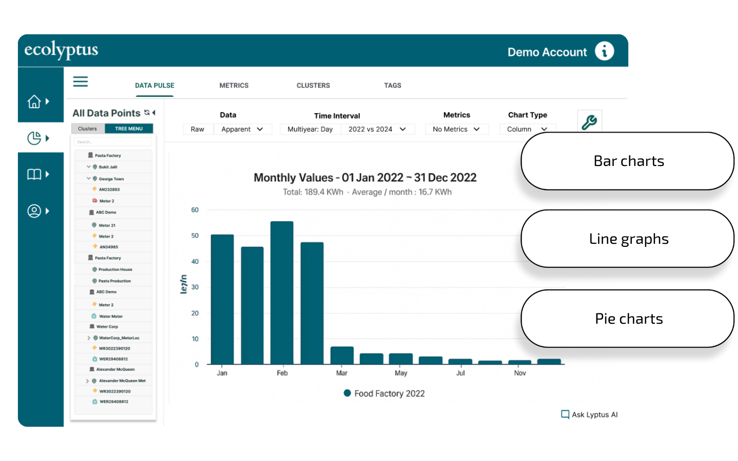
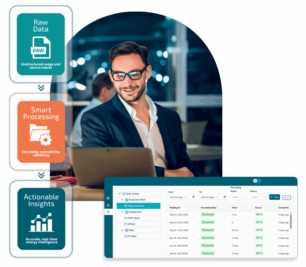
Data Pulse visualizes energy usage in real time with a variety of interactive graphs — line, pie, stacked, and more. These flexible visualization tools make it easy to spot trends, compare sites, and track performance over time. Turn raw consumption data into clear energy usage insights for smarter decision-making.
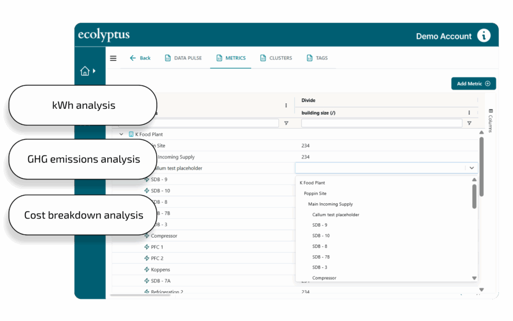
Metrics that matter
Data Pulse lets you track the metrics that matter most — from kWh usage and carbon emissions to detailed cost analysis. Switch seamlessly between views to understand energy consumption, environmental impact, and financial performance together in one energy data dashboard. This gives a complete picture to drive better decisions.
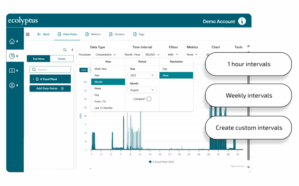
Flexible time intervals
Data Pulse gives you full flexibility to view performance across any interval — hourly, daily, weekly, monthly, yearly, or custom ranges. Easily zoom in for detail or step back for the bigger picture. These time-based energy metrics help you monitor trends and track your energy reduction progress over time.
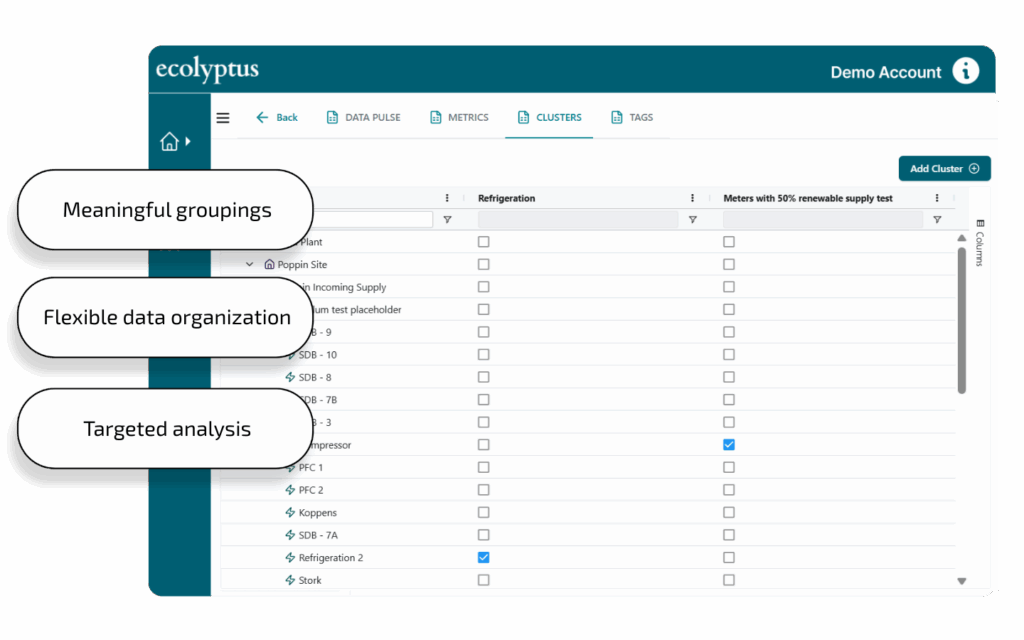
Clusters & tags to simplify complexity
Organize complex, multi-meter installations using flexible clusters and descriptive tags so you can group meters by HVAC, lighting, production, or business units. Apply multiple tags to drill into the exact areas that matter most for your cost-saving and consumption optimization goals.
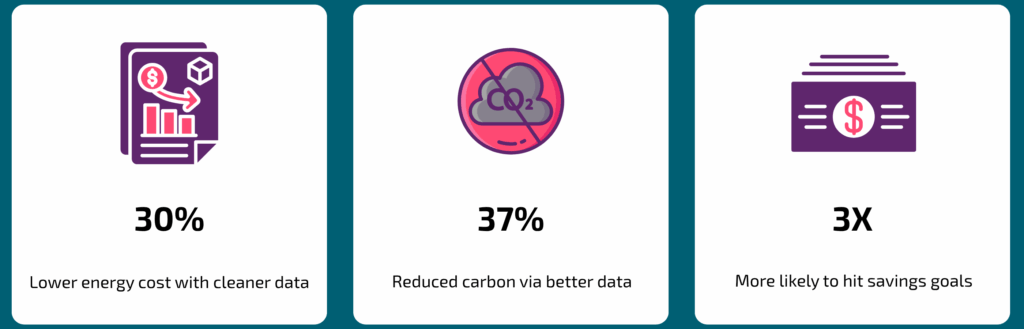
Better data = bigger ROI
ecolyptus Data Pulse turns raw energy data into clean, actionable intelligence. With energy data analytics + usage visualisation + emissions tracking, you can unlock faster savings, smarter investments, and measurable returns across your energy portfolio.