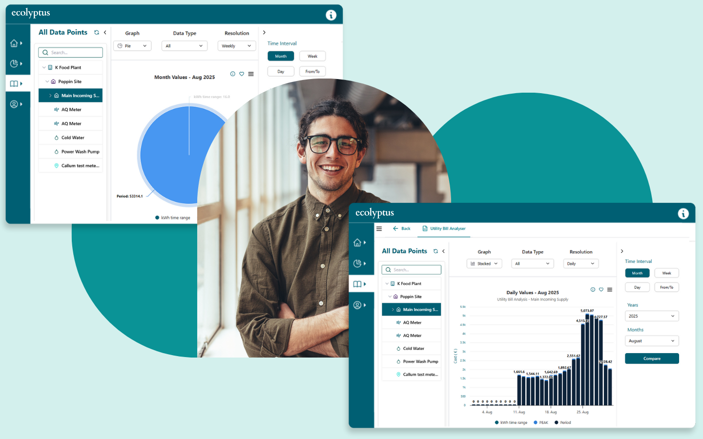
Analyze costs, kWh, peak demand, and usage trends with clear visual graphs. Quickly uncover insights that help you control spend and improve efficiency.
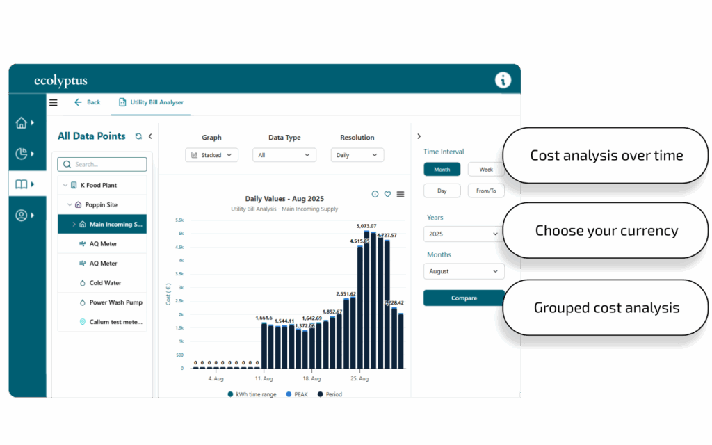
Break down costs across each bill to clearly see where money is being spent. The analyzer highlights charges across various periods, making it easy to compare bills over time, spot irregularities, and monitor overall utility spend with complete transparency.
Analyze energy usage across bills
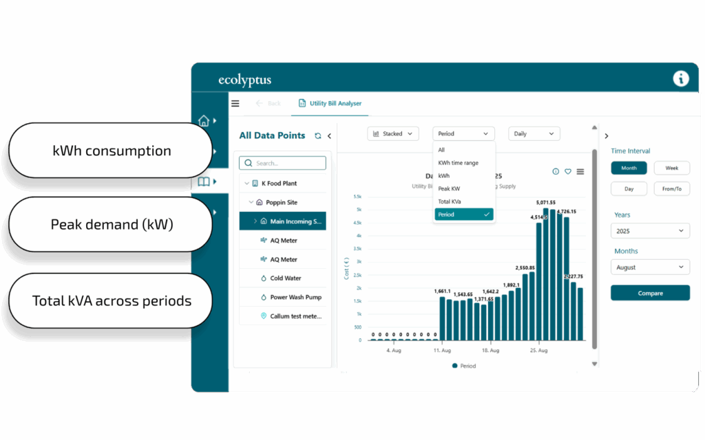
Go beyond the headline numbers by exploring detailed usage data. Assess kWh consumption, peak demand (kW), and total kVA across time ranges to understand how usage patterns align with tariffs. This allows you to pinpoint inefficiencies and identify opportunities to reduce energy costs.
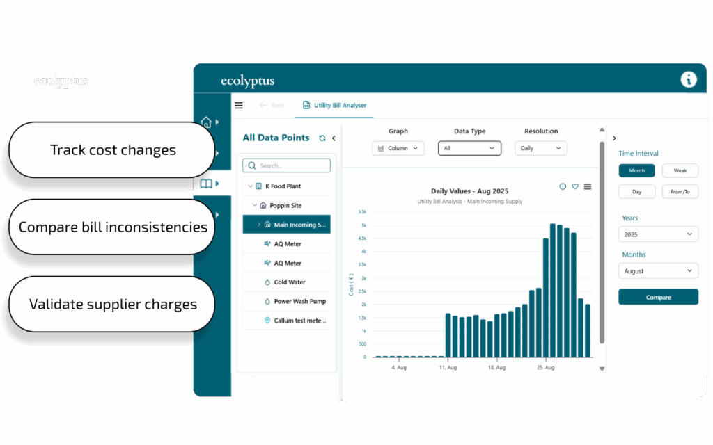
Visual insights for utility bills
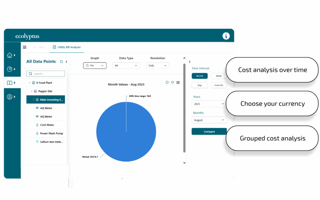
Transform raw billing data into clear, actionable insights with a range of chart types, including stacked, column, and pie charts. Compare usage and costs across hours, days, months, or years to quickly reveal trends, anomalies, and performance shifts that might otherwise go unnoticed.
Comparative analysis across bills
Analyze multiple utility bills against each other to gain a deeper perspective. Spot discrepancies across providers, track changes in charges or tariffs, and ensure consistency and accuracy over time. This makes it easier to hold suppliers accountable and optimise contract decisions.
Ready to take your energy and sustainability reporting to the next level?